Get In Touch
attila.ando.aa@gmail.com
+971 55 305 3869

Onboarding for a Chat Application

ROLE: LEAD PRODUCT DESIGNER

INDUSTRY: WEB3, MESSAGING, TELECOMMUNICATION

SCOPE: ONBOARDING, MULTI-DEVICE LOGIN, DATA STORAGE, BACKUP AND RECOVERY

IMPACT: 98% COMPLETION, 95% ACTIVATION, <4% ERROR RATE

Overview

A true 0→1 build: a native chat application for a Southeast Asian market, built around privacy, security, and mobile-first social behaviour.
Onboarding carried more weight here than onboarding usually does. It had to register users, yes — but it also had to establish trust, show the product’s value, meet local expectations, and get people into the app fast enough to avoid drop-off. That made it a product decision, not a screen-design task. The flow sat on top of strict security requirements, sensitive permission requests, multilingual complexity, and the need to move someone from first launch to first meaningful action with almost no friction.
My job was to turn those constraints into a clear, scalable entry into the product.

The Challenge

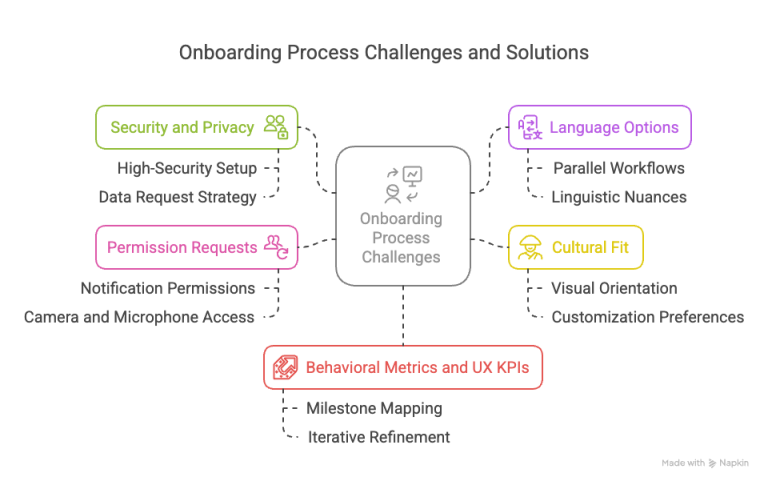
The flow had to do six things at once: build trust immediately, reduce entry friction, support secure authentication, handle multiple permissions without overwhelming anyone, work naturally across two structurally different languages, and prepare users for activation — not just account creation.
The hard part was that these goals pulled against each other. Security adds steps. Permissions add friction. Localisation changes content hierarchy and interaction patterns. And the audience still expected something modern, intuitive, and culturally familiar. Without careful design, the whole thing tips into over-engineered and slow.

My Role

I owned the onboarding direction from concept to execution: the UX strategy, the information architecture, the end-to-end flow logic, the alignment between user needs and security and technical requirements, the edge cases and recovery paths, and the localised behaviour — through to testable prototypes.
The goal wasn’t only a usable flow. It was a product-ready one: clear enough for users, robust enough for engineering, scalable enough for what came next.

Discovery - The Problem

The real problem was set by product architecture, not UX optimisation. Two decisions shaped everything: how to balance security, privacy, and usability — and what storage model to use, since that determined how recovery and required user data would work.
Security vs. usability

Strong protection from the first interaction, in an experience that still had to feel fast and familiar.

Privacy vs. recovery

Privacy-first decisions improved protection but reduced how much the system could help if someone lost access or changed devices.

The storage decision

How user data is stored directly shaped security, continuity, and what restoration was even possible.

Recovery starts at onboarding

Recovery couldn't be designed later. The first flow had to lay the foundation for secure restoration.

Required data matters

The minimum data asked of users wasn't a form-design choice. It set what the product could verify, recover, and protect later.

So this was never about cutting screens. It was about turning a privacy-first architecture into a usable way into the product.

The Solution

I defined the solution across five connected questions — aiming not just to reduce friction, but to hold security, privacy, recovery, and activation together.

Reduce unnecessary decisions at the start

Remove avoidable choices — like separate login and sign-up paths — and route users automatically through system logic.

Introduce security without making it feel heavy

Integrate OTP, PIN setup, and future biometric readiness so they read as trustworthy, not disruptive.

Define the minimum viable data

Decide which data points were essential at onboarding and how they would support recovery later.

Sequence the permissions

Ask for things based on immediate value, product necessity, and trust timing — not all at once.

Design for failure, not just success.

Handle OTP failures, retry limits, wrong inputs, re-entry, and recovery fallbacks from the start.

The Process

Research

I mapped the full passkey ecosystem across onboarding, registration, reset, replacement, and daily usage to understand how the product worked across both pre-login and post-login contexts.

Information architecture

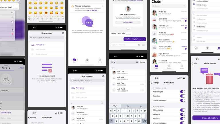
I reduced onboarding to a few meaningful stages, each with a clear role: introduce value and trust, verify the mobile number, set up secure access, and enable controlled entry into the product. Less cognitive load, without losing the logic security, privacy, and recovery required.

User flows

I mapped the flow end to end — new-user onboarding, returning-user detection, OTP verification and fallback, PIN creation and confirmation, permission timing, failure states, retry logic, and backup and recovery. The complexity was never in the number of screens. It was in the number of decisions, conditions, and system states the experience had to handle cleanly.

Interaction design

A few decisions did most of the work. Automatic account detection removed the sign-up-versus-login confusion. Smart OTP behaviour cut manual effort and sped up verification. PIN-based, device-level security was built with recovery logic for trust and continuity. Language support was handled at the architectural level from the start, not bolted on. And permissions were staged to keep friction away from the entry point.

Error and edge-case handling

A large share of the work went into the breakdown points: invalid or expired OTPs, resend and wait states, failed PIN confirmation, too many retries, interrupted onboarding, partial completion, and re-entry. This is where execution maturity shows — the experience is only as good as how it behaves when things go wrong.

The Outcome

The architecture-led approach paid off where it mattered: a flow that stayed simple on the surface while carrying a real security model underneath.
4-step flow

Condensed onboarding into four purposeful steps, security model intact.

98% completion

A low-friction entry users could finish quickly and confidently.

95% activation

Most users took a meaningful first action right after onboarding, not just created an account.

<4% error rate

Most issues traced to minor input, not structural flow problems.

What I Have Learnt
Onboarding in a secure product is never just a usability exercise. Encryption, privacy, storage, and recovery shaped the experience from the very first step — which is why understanding the technical foundation early let design set the right flow logic instead of reacting to constraints too late.
A few things held true:
  • Security and privacy decisions shape usability more than most teams expect.
  • Fewer steps isn’t the goal. Decision clarity is — screen count matters less than how clear each choice is.
  • Thoughtful automation removes effort, speeds the flow, and makes it feel more considered.
  • Storage and recovery logic belong in onboarding from the beginning, not after.
  • Early technical understanding is what reduces rework later.
0→1 design isn’t about filling empty screens. It’s about choosing the right structure before anything gets built. The closer the connection between technical reality and design thinking, the stronger the experience is at launch — and the easier it is to scale.

This website stores cookies on your computer. Cookie Policy