The Captivity Well
A framework for reading retention when users cannot leave
Framework paper · September 2026
Summary
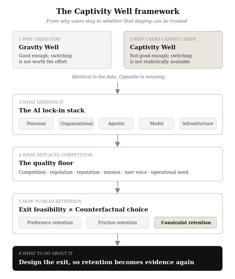
Product teams read retention as a verdict on quality. That reading only holds when users could realistically leave. In public services, heavily integrated enterprise platforms and, increasingly, AI products, users often stay not because the product earns it, but because leaving costs more than staying.
This paper extends the Gravity Well concept, which explains why users stay with products that are good enough, into a second mechanism: the Captivity Well, which explains why users stay with products that are not. It also:
- Describes how AI builds captivity faster than earlier software;
- Shows where the cost of poor design goes when users cannot leave;
- Proposes a method for separating earned retention from trapped retention;
- Closes with a worked example and practical guidance on designing the exit.
The models and the scoring method in this paper are conceptual. They synthesise established research on switching costs, exit and voice, and administrative burden, together with recent findings from competition authorities. They have not been empirically validated. Their purpose is to change which questions a product organisation asks, not to replace judgement with a score.
1. The problem: usage without exit
Some years ago, a service provider charged me twice for the same service, and the call to customer service went nowhere. My mentor, sitting across the desk, pointed out what I had missed. The agent on the phone was the only person who could solve it, and walking away would not undo the charge. The problem was eventually solved. But the situation stayed with me: an unhappy customer with nowhere else to go.
From the provider’s side, that call looked like a retained customer. That is the problem this paper addresses. When exit is unavailable, the signal that normally tells a provider its product is failing goes quiet. Dashboards keep reporting success. Dissatisfaction does not disappear. It moves somewhere the dashboard is not looking.
2. Key terms
Term
Meaning in this paper
Service-driven mindset
Captivity Well
Contestability
Exit feasibility
Adoption moat
Exit moat
Quality floor
Preference retention
Friction retention
Constraint retention
3. Starting point: the Gravity Well
The Gravity Well explains why specialist AI products struggle against general-purpose assistants. A tool that is familiar, always available and good enough across many tasks becomes the default. A specialist alternative may be clearly better at one job, but the improvement is smaller than the effort of finding, learning and adopting it.
As a conceptual model, a user switches only when:
Value of the alternative − Value of the current product > Switching cost + Learning cost + Coordination cost + Risk
In the Gravity Well, the left side is too small. The alternative is better, just not better enough.
The model rests on one assumption: that the user could leave. It describes a choice not to switch. It does not cover situations where switching was never realistically available.
4. The Captivity Well
A second mechanism produces the same visible behaviour, the user stays, for the opposite reason.
Gravity Well: “This is good enough, so switching is not worth the effort.”
Captivity Well: “This is not good enough, but switching is not realistically available.”
In the Gravity Well, the left side of the equation is too small. In the Captivity Well, the right side becomes disproportionate, or no viable alternative exists at all.
Two questions, whether the product is good enough and whether exit is realistic, give four situations:
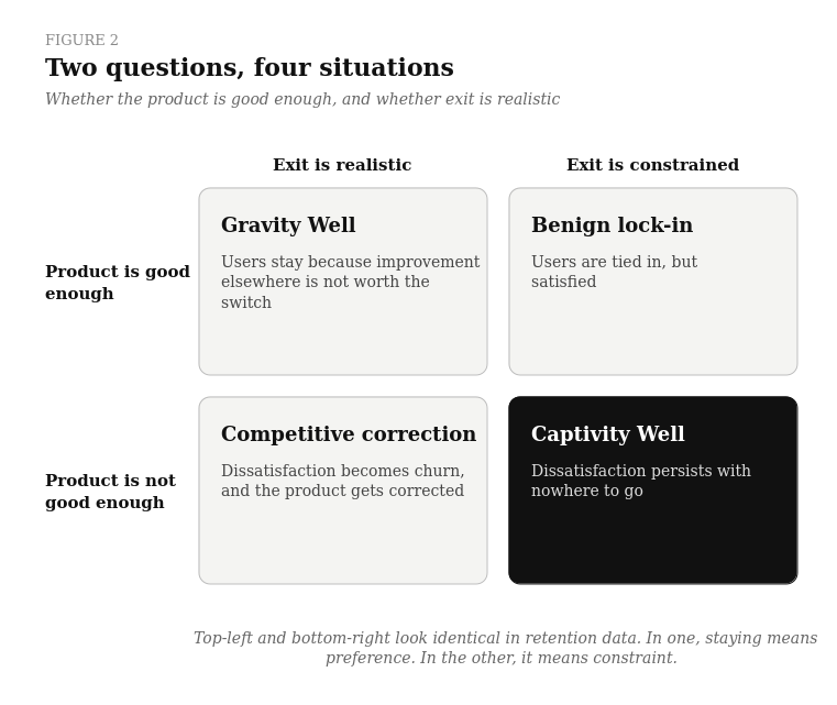
The Gravity Well and the Captivity Well look identical in behavioural data. In one, staying means preference. In the other, staying means constraint. When leaving is expensive, usage stops being evidence of preference.
Captivity has several sources, and most products combine more than one:
Source
Why users stay
Typical examples
Legal or institutional
Technical
Contractual
Network
Organisational
Data and workflow
Context
Risk
The pattern is not limited to one industry. Changing banks means rebuilding salary arrangements, standing orders, cards and payees. Changing payroll systems means re-validating every employee record. Changing an AI platform means rebuilding everything the platform has learned. Wherever the experience is poor and leaving is expensive, users absorb the poor experience rather than pay the price of moving.
5. Contestability, not competitor count
Captivity does not require a monopoly. Farrell and Klemperer showed that switching costs and network effects can give a supplier market power over customers it has already won, even after competing hard to win them. Many markets move through two phases: competition for the customer, then lock-in after adoption. On paper, competitors still exist. In practice, the installed customer negotiates with the only supplier it can realistically use.
The relevant variable is therefore contestability, not the number of competitors.
Hirschman’s Exit, Voice, and Loyalty explains what happens when contestability is low. People respond to decline by leaving or by speaking up. When exit is blocked, voice has to carry the full load. The meaningful comparison is not private companies against governments. It is between three kinds of system: those disciplined by exit, those disciplined by something else, and those disciplined by neither. The third group is where quality erodes without anyone noticing.
6. The AI lock-in stack
The claims in this section are propositions. They are grounded in regulatory evidence at the infrastructure layer and in observable product patterns above it. The personal, organisational and agentic layers have not yet been studied empirically, and section 13 sets out how they could be.
Most software builds switching costs slowly, through data and integrations accumulated over years. AI products appear to build them faster, in layers that are harder to see:
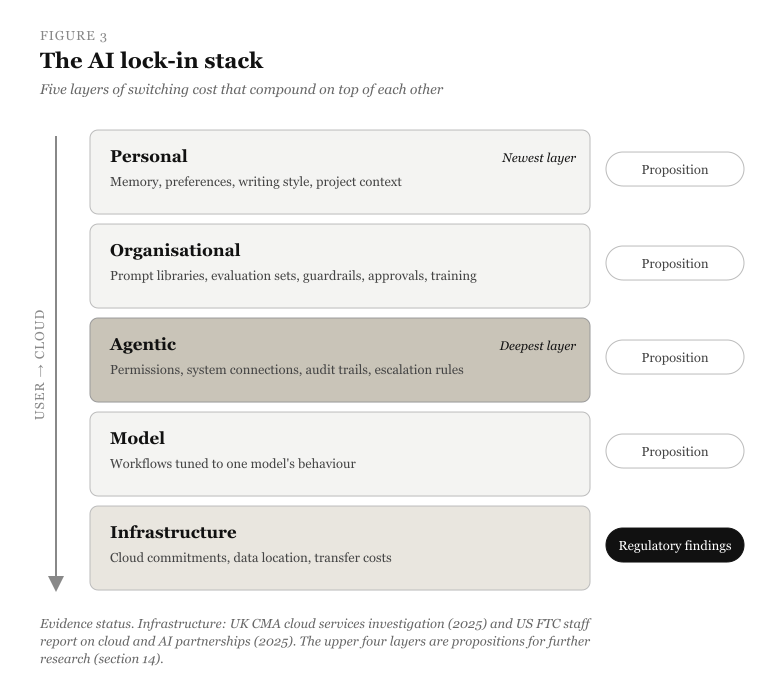
The personal layer is the newest and least discussed. An assistant that learns a user’s context becomes more useful every week. That is the point. It also means that value mostly stays behind when the user leaves. The agentic layer is the deepest. Agents carry keys to internal systems and embody decisions about who approves what. Replacing them is an organisational change, not a software change.
The evidence at the bottom of the stack is already clear. In July 2025, the UK Competition and Markets Authority concluded its cloud services market investigation. It found that fewer than 1% of customers switch cloud provider in a year. The barriers were transfer fees, technical differences, integration difficulty and a shortage of transferable skills. The CMA linked customers’ ability to switch directly to providers’ incentive to improve. Separately, the US Federal Trade Commission published a staff report in January 2025 on partnerships between cloud providers and AI developers. It noted that these arrangements can raise both contractual and technical switching costs.
Regulation is beginning to target exit directly. The EU Data Act, applicable since September 2025, includes provisions intended to make switching between cloud and data-processing providers work in practice. The regulatory question is moving from “is the incumbent charging too much?” to “can the customer leave?”
6.1 The captivity lifecycle
AI products tend to follow a recognisable path:
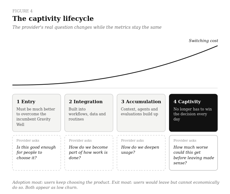
The shift from the first question to the last is rarely deliberate and never announced, and the metrics look the same throughout. An adoption moat and an exit moat both appear as low churn. Few strategy reviews separate them.
6.2 Agents cut both ways
The same agentic capability that deepens lock-in can also dissolve it. An agent can compare offers, move data, rebuild configurations and handle the paperwork of switching. That lowers the effort of leaving dramatically. Much of captivity has always rested on effort rather than rules. Nobody forbids a customer from changing banks; it is simply tedious. Tedium is what agents are best at removing.
There is a second shift. As agents act on behalf of users, the user may stop experiencing products directly. The agent becomes the customer. Agents do not form habits or feel attached to familiar interfaces. They evaluate outcomes. The competitive frontier has already moved from goods to services to experiences. In the agentic era, it moves towards systems where AI acts for the user. A provider that relies on friction to retain customers is betting that users will keep doing the switching work themselves. That bet weakens every year.
7. Where the cost of poor design goes
In a competitive product, poor experience costs the provider: a confusing checkout loses the sale. In a product users cannot leave, the transaction usually still happens, and the cost moves to the user.
Provider complexity → User time + cognitive effort + errors + support needs
Public services face the hardest version of this problem, because many are the only provider by design. The OECD’s work on “sludge” treats unnecessary friction as a substantive barrier to access rather than a cosmetic issue. The research supports that position. Bhargava and Manoli ran a field experiment with the US Internal Revenue Service. It involved around 35,000 tax filers who appeared eligible for the Earned Income Tax Credit but had not claimed it, together worth roughly $26 million. Simpler, clearer notices increased claiming. The study shows how evidence can locate the point where design stands between people and what they are entitled to.
When users cannot easily leave, dissatisfaction does not appear as churn. It appears as unclaimed value, errors, delays, support contacts, workarounds and reliance on intermediaries.
8. The quality floor
If competition is not setting the minimum standard, something else has to. As a simplified model, the provider’s quality floor can be treated as the strongest of several pressures acting on it:
Quality floor = the highest of (competition, regulation, reputation, mission, user voice, operational need)
Operational need is the quality required simply to keep the service running at acceptable cost: error rates, support volumes and manual rework the organisation cannot afford to carry.
The model is a simplification. In practice, pressures can reinforce or offset each other. A strong mission can be undermined by weak funding, and reputational pressure can amplify regulation. But the simplification makes one point clear. A product’s quality floor is set by whichever pressure is actually binding, not by the one the organisation talks about.
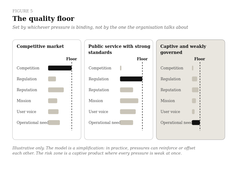
In a competitive consumer market, competition usually sets the floor. In a public service, the competition term is close to zero, so regulation, mission, accessibility obligations and user voice must do the work. They can. The UK Government Digital Service Standard assesses services on six things: understanding users, solving a whole problem, simplicity, accessibility, iteration and performance measurement. The assessments are published. HMRC’s “View and change your tax account” service was rated Red at alpha assessment in June 2024. The assessors acknowledged real strengths and identified journeys that needed more testing. The team worked through the findings, and the February 2025 reassessment moved the service to Amber. No competitor drove that improvement. A deliberately designed feedback loop did.
The risk zone is a captive product where every pressure in the model is weak at once. Competition is one way to create a quality feedback loop. It is not the only way. But some loop must exist, and when exit is weak, it has to be designed on purpose.
9. Three types of retention
Observed retention can be decomposed into three components:
Observed retention = Preference retention + Friction retention + Constraint retention
Two questions assign each retained user to exactly one component:
- Would they choose the product again if switching were effortless?
- Could they realistically leave?
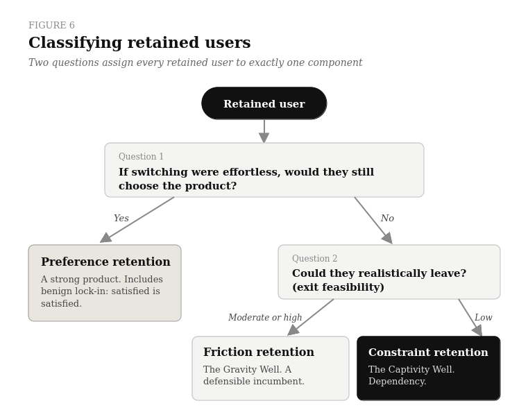
- Benign lock-in counts as preference retention. A satisfied user is satisfied, whatever their exit options.
- The Gravity Well contains both preference and friction retention, depending on whether users would actively choose the product again.
- The Captivity Well is constraint retention.
- Competitive correction does not appear in retention at all, because those users have left.
The same logic explains the three kinds of “good enough” the phrase currently blurs together:
Equilibrium
What the user thinks
Retention component
Satisficing
Locked-in
Mandatory
These are different kinds of advantage:
- Preference retention indicates a strong product.
- Friction retention indicates a defensible incumbent.
- Constraint retention indicates dependency.
They should not be reported as one number. Constraint retention also carries a hidden risk. It looks like strength until something lowers the cost of leaving: a regulation, an open standard, a migration tool, an agent that does the switching. An incumbent that mistook captivity for satisfaction can discover quickly how shallow its well was.
10. Measurement toolkit
10.1 Exit feasibility assessment
The assessment below is a working method, not a validated instrument. It is meant to make the conversation about exit concrete and comparable across a team, not to produce a score that stands on its own. It can be applied to a whole customer base or, more usefully, to individual segments. Each of six factors is rated from 0 (exit effectively blocked) to 3 (exit straightforward).
Factor
Guiding question
0
3
Substitutes
Technical
Financial
Organisational
Context
Risk
As a rough guide, a total of 0–6 suggests low exit feasibility, 7–12 moderate and 13–18 high. The bands are indicative, not calibrated thresholds, and the factors are not equally weighted in every context. For a regulated service, a single 0 on Substitutes or Risk can outweigh everything else. The value of the exercise lies less in the total than in the disagreements it surfaces. When product, engineering and commercial teams score the same factor differently, that gap is usually the most useful finding.
10.2 Estimating the three retentions
The decomposition in section 9 becomes measurable with two inputs.
The first is exit feasibility, scored per segment using 10.1.
The second is a counterfactual choice question, asked in research or in-product: “If switching to another option were effortless, would you still choose this product?”
Each retained user is then assigned using the rule in section 9:
- “Yes” → preference retention.
- “No” in a moderate or high feasibility segment → friction retention.
- “No” in a low feasibility segment → constraint retention.
The estimate is approximate. Stated intentions are imperfect, and the question should be asked neutrally and repeated over time. But even a rough split changes the conversation. A product can no longer present 95% retention without saying what it is made of.
10.3 Measuring where dissatisfaction goes
When exit is constrained, churn is a poor signal. The metrics below follow dissatisfaction to where it actually appears:
Dimension
General signal
AI-specific signal
Task quality
User effort
Trust burden
Failure
Support dependency
Workarounds
Voice
These signals matter most in the constraint segment, where they are the only honest channel dissatisfaction has left.
11. Worked example: an enterprise AI assistant
The organisation, figures and results below are hypothetical and illustrative.
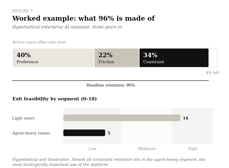
A mid-sized organisation has used an enterprise AI assistant for three years. It is used across the business for drafting, summarising and research. Two departments also run agents that triage incoming requests and prepare approvals. Annual renewal retention is reported at 96%, and the platform is considered a success.
Exit feasibility. The assessment reveals two very different segments.
Factor
Light users (drafting and search)
Agent-heavy departments
Substitutes
Technical
Financial
Organisational
Context
Risk
Total
The disagreements were more revealing than the totals. Product scored the agent-heavy Context factor at 2, assuming prompts could be copied across. Engineering scored it 0, because agent configurations, memory and evaluation sets had no export path.
Decomposition. A short in-product survey asks the counterfactual question. Combined with the segment scores, the 96% breaks down roughly as follows:
Component
Share of users
What it means
Preference retention
Friction retention
Constraint retention
More than a third of the headline retention is constraint. Almost all of it sits in the departments running agents, the most strategically important use of the platform.
Where dissatisfaction goes. In the constraint segment, human takeovers of agent workflows have risen steadily. Re-prompting per task is up. Two teams are quietly running unofficial tools alongside the platform for the same work. None of this appears in retention.
What changes. Leadership does not treat this as a reason to switch vendors. It treats it as three decisions:
- Agent reliability becomes the product priority, ahead of new features.
- Portability of agents, memory and evaluation sets becomes a requirement in the next renewal negotiation.
- The counterfactual question and the takeover rate join retention on the quarterly dashboard.
The headline number is the same. What it is understood to mean is not.
12. Designing the exit
Product organisations invest heavily in onboarding and almost nothing in offboarding. In dependency-heavy products, the exit experience is part of product quality, and a design responsibility.
Question
Why it matters
A product that is easy to enter and deliberately hard to leave may have excellent growth design and poor market design. Organisations that design a credible exit also gain something less obvious: retention they can trust as evidence.
13. Diagnostic questions for product leaders
- How much of our retention is preference, friction and constraint?
- What is our exit feasibility by segment, and how would a competitor, a regulator or an agent change it?
- Where does dissatisfaction go in our product, if not to churn?
- Which pressure is actually setting our quality floor today?
- Are we building an adoption moat or an exit moat, and does our strategy say which?
- If switching became effortless tomorrow, which of our users would stay?
The last question matters most. The answer is the real size of the product.
14. Open questions for further research
The framework suggests several testable propositions:
- Exit: as effective switching costs rise, the relationship between dissatisfaction and churn should weaken.
- Burden substitution: in mandatory services, poor design should appear less as churn and more as errors, incomplete take-up, delays and support demand.
- Accountability substitution: where exit is weak, strong non-market mechanisms should be associated with better service quality. Examples are independent assessment, published metrics and systematic user research.
- Portability: lowering technical and financial switching barriers should increase quality pressure on incumbents.
- AI compounding: AI ecosystems should accumulate switching costs faster than earlier software, because the personal, organisational, agentic, model and infrastructure layers stack.
- Agentic reversal: agents capable of executing switches should reduce friction retention faster than constraint retention.
A comparative study could place products along two dimensions, exit feasibility and accountability strength. It would then compare user burden and service outcomes across the four resulting environments. Its central question would apply equally to governments, enterprise software and AI ecosystems: what forces a provider to improve when users cannot credibly leave?
15. Conclusion
“Good enough” is not a quality concept. It is an equilibrium. It is healthy when it describes a user’s free judgement that further improvement is not worth switching for. It becomes a problem when it describes a supplier’s judgement that further improvement is unnecessary, because users cannot leave anyway.
The less power users have to leave, the more responsibility the provider carries for voice, usability and accountability. That applies to public services, banks and enterprise platforms. Increasingly, it applies to the AI systems that learn our context and act on our behalf.
A user who cannot leave is not a loyal user. Just a quiet one.
References
- Bhargava, S. and Manoli, D. (2015). Psychological Frictions and the Incomplete Take-Up of Social Benefits: Evidence from an IRS Field Experiment. American Economic Review, 105(11), 3489–3529. https://doi.org/10.1257/aer.20121493
- Competition and Markets Authority (2025). Cloud services market investigation: Summary of final decision, 31 July 2025. https://assets.publishing.service.gov.uk/media/688b20e6ff8c05468cb7b120/summary_of_final_decision.pdf
- European Union (2023). Regulation (EU) 2023/2854 (Data Act), applicable from 12 September 2025. https://eur-lex.europa.eu/eli/reg/2023/2854/oj/eng
- Farrell, J. and Klemperer, P. (2007). Coordination and Lock-In: Competition with Switching Costs and Network Effects. In Handbook of Industrial Organization, Vol. 3, Chapter 31. https://www.sciencedirect.com/science/chapter/handbook/abs/pii/S1573448X06030317
- Federal Trade Commission (2025). Partnerships Between Cloud Service Providers and AI Developers. FTC Staff Report on AI Partnerships & Investments 6(b) Study, January 2025. https://www.ftc.gov/reports/ftc-staff-report-ai-partnerships-investments-6b-study
- GOV.UK. Service Standard assessment reports: View and change your tax account:
- Alpha assessment, 25 June 2024. https://www.gov.uk/service-standard-reports/view-and-change-your-tax-account-alpha-assessment
- Alpha reassessment, 17 February 2025. https://www.gov.uk/service-standard-reports/view-and-change-your-tax-account-alpha-re-assessment-report
- GOV.UK. Service Standard. Government Digital Service. https://www.gov.uk/service-manual/service-standard
- Hirschman, A. O. (1970). Exit, Voice, and Loyalty: Responses to Decline in Firms, Organizations, and States. Harvard University Press. https://www.hup.harvard.edu/books/9780674276604
- OECD (2024). Fixing frictions: “sludge audits” around the world. OECD Public Governance Policy Papers, June 2024. https://www.oecd.org/en/publications/fixing-frictions-sludge-audits-around-the-world_5e9bb35c-en.html